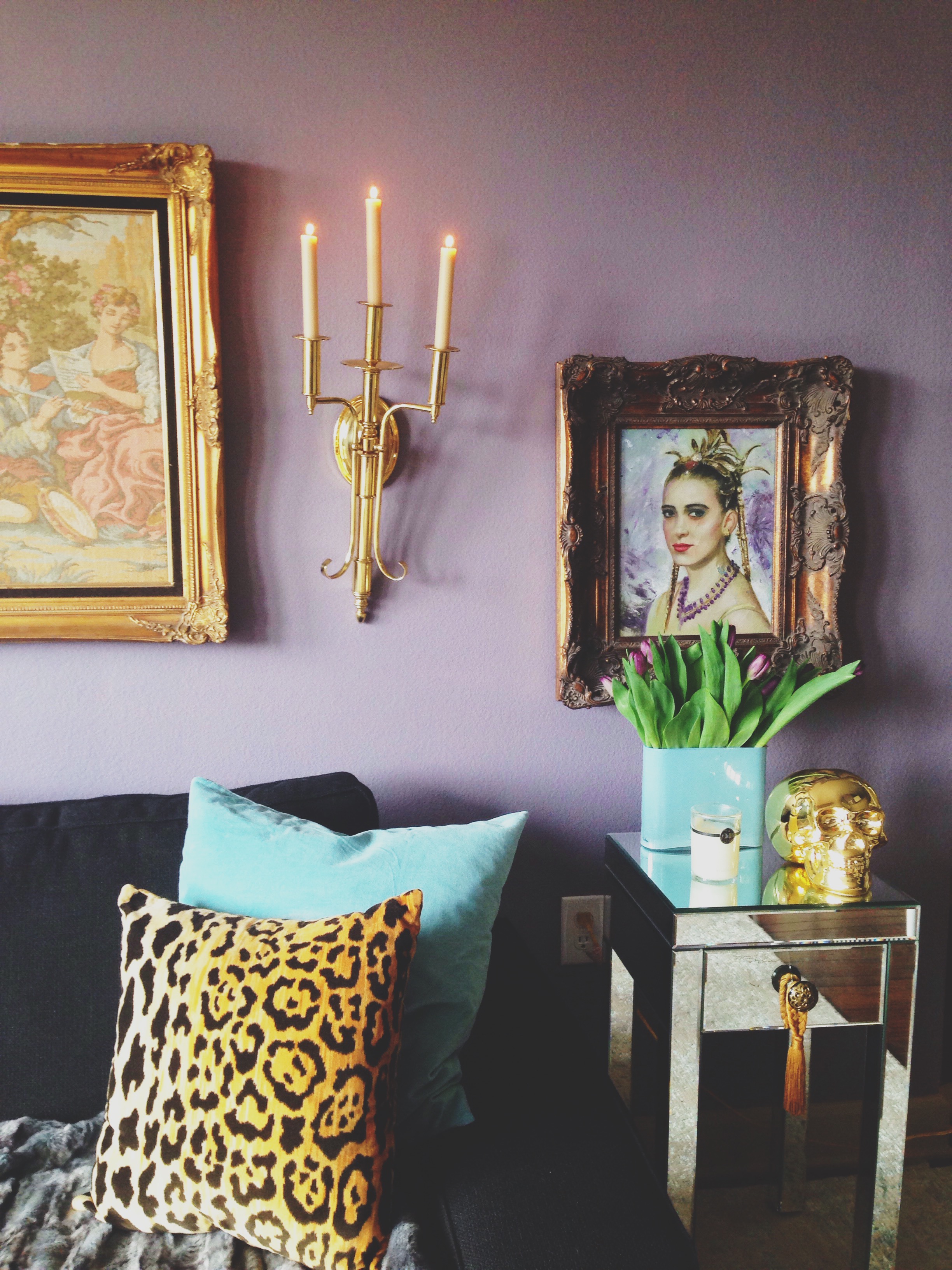
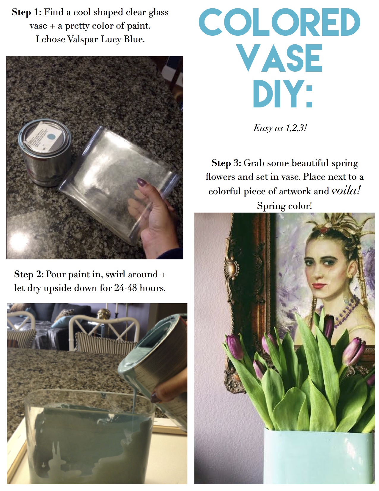
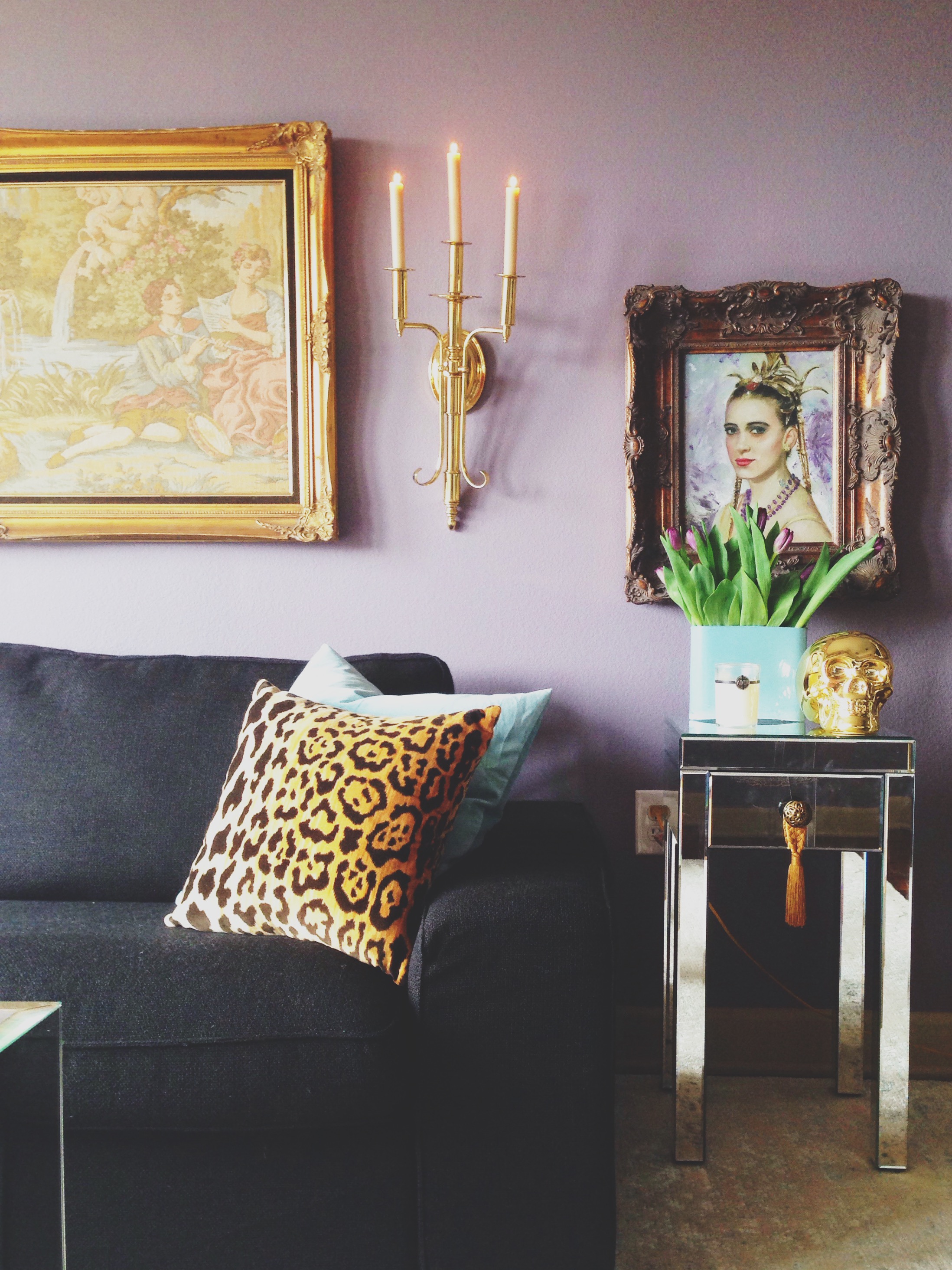
With Spring here, I have been adding more and more color into my home. I've been loving soft shades just perfect for Spring. I'm all about adding fresh flowers to my space every weekend and found some gorgeous lavender tulips I have been dying to use in my living room. I just needed a fab vase for them. All my vases are either black, white or gold so I wanted to switch things up a little bit for this weekend. I stumbled upon an old clear unique shaped vase I have had for a while and decided to give it a makeover with some pretty paint. With the launch of Valspar's 2015 color trends, I wanted to incorporate the color Lucy Blue from the 'Picture Perfect' color palette into my space, which I got at Lowe's.
When developing its Color Trends report this year, Valspar identified some of the most influential cultural movements that would define 2015's color palettes. Because it reminded me of the beautiful variety of instagram filters, I was drawn to the "Picture Perfect" palette. It embodies the warm, connective nature of self-expression aka 'selfies'. It has soft coral tones with tan and copper hinting at human interaction with grey and dreamy shades of blue reminiscent of filter effects. Pretty cool.
Here is how it went down...
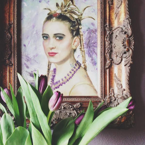
My little mirrored sofa side table needed some color to pick up the gorgeous colors in the old artwork my uncle gave me. So, because I wanted to take a nod from Valspar's color ambassador Genevieve Gorder, I decided that since I have a lot of gold, the pop of perfect blue does so much for that nook and goes perfectly with the pillows on the sofa. The color just adds so much to the room, makes everything feel brighter and a bit up-lifting. I always love a good pop of joy!
Now you can try grabbing some pretty Spring blooms, a pretty paint color from Valspar color trends & insert some joy in your home. Happy weekend decorating! xo

