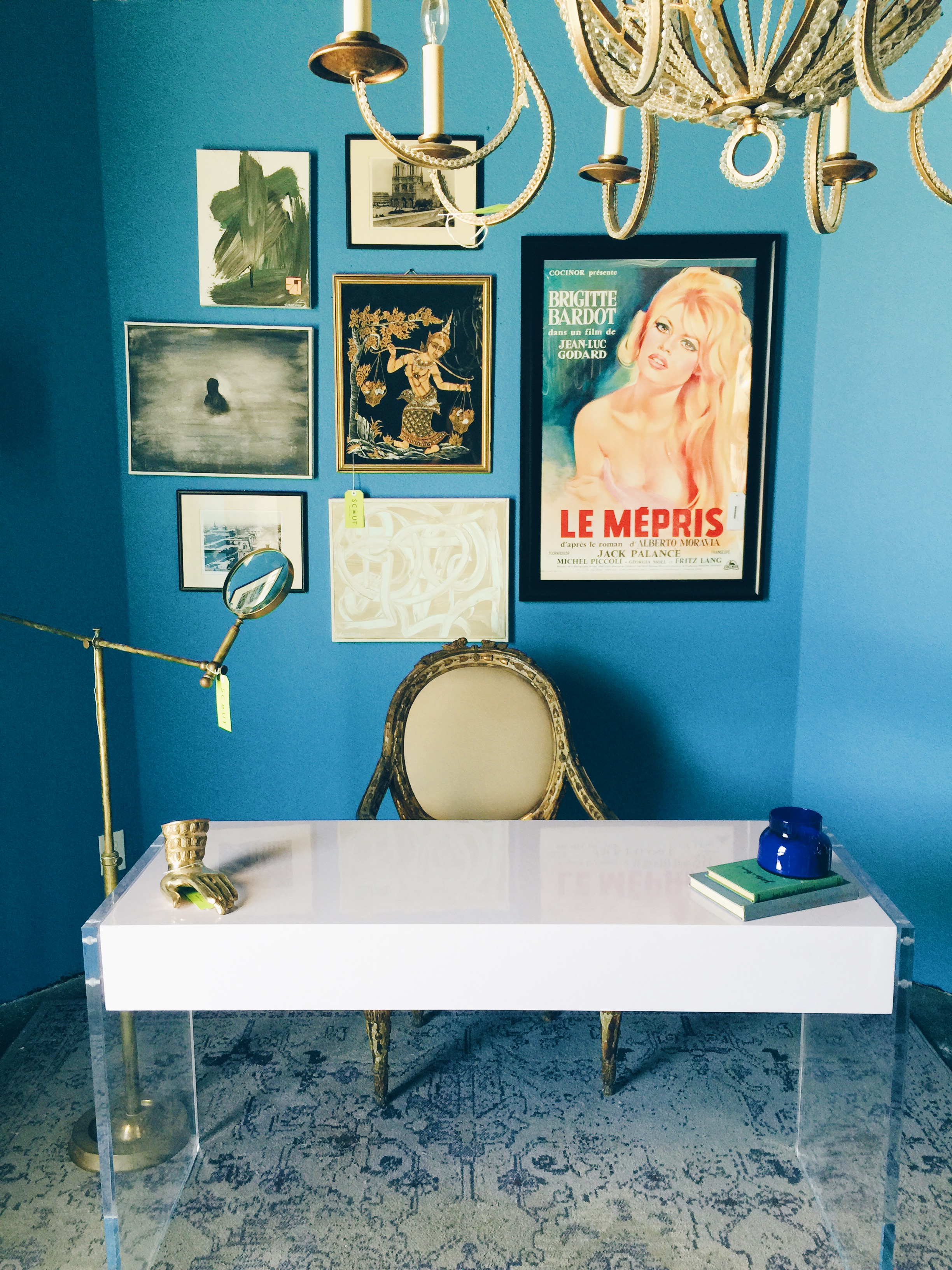
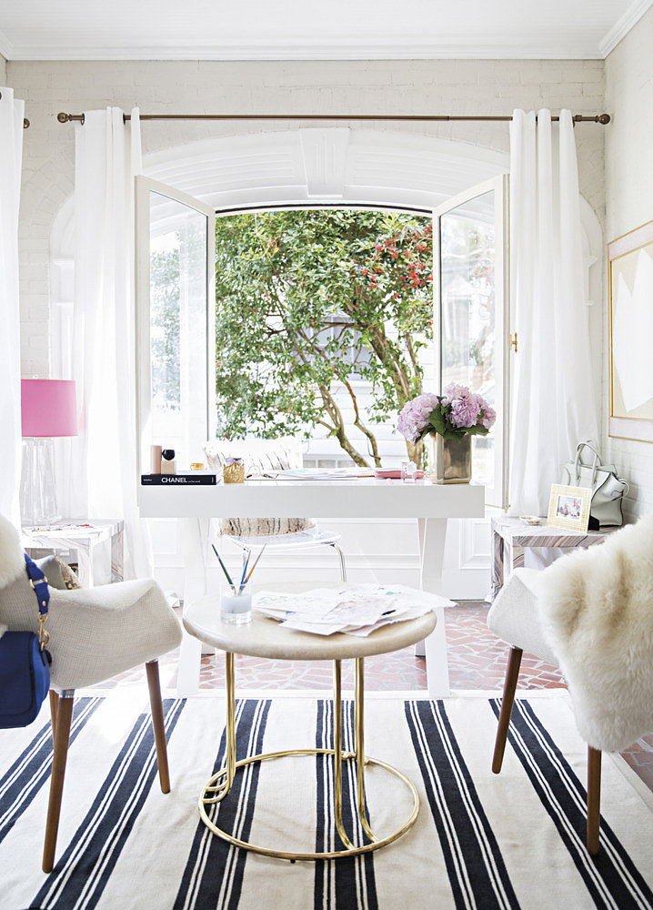
In my business, I sometimes underestimate my clients fears. The other day, I found myself having to explain to a client why putting in a clear coffee table in the living room will make the room feel lighter and brighter. Fears about it being tacky or too 80's seemed to be the major underlying concern. Part of my job as a designer is explaining the WHY behind every detail. So I thought I'd share my feelings about this on the blog too.
I absolutely love lucite or anything acrylic for the home. Aside from anything trendy or stylish, it helps to make a space not feel too weighed down. It also allows anything held inside to be displayed fabulously while looking put together and organized. Think glass kitchen cabinets and the beautiful displays of dishes on the inside. You will rarely turn the pages of a design magazine and not see some kind of lucite piece that absolutely steals the shows. It makes a home look effortlessly chic. You can absolutely do it wrong, but here are some ways to get the look right.
Above photo from Victoria Solomon home via Mydomaine // below thebrunetteone
COFFEE TABLES. I looooooove lucite coffee tables or even clear glass coffee tables. I love the way it makes a living room look polished and pretty. Light reflects off so well and bounces around the room giving it a nice flow of energy. Take for example this room below, its a tight space with plenty of seating and storage. Those pieces are large and bulky which make for a super cozy feel and the clear coffee table serves as a highly functional piece but helps the room not to feel overwhelming.
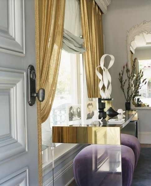
CONSOLE TABLES. When you are working with an entryway that has limited space or even a sofa or vanity table a lucite piece makes such a fabulous little addition. It gives you a functional table without the bulk or visual space. Like in the above photo this waterfall console lets the wallpaper have its full power while still giving you a perfectly fab table.
domino magazine
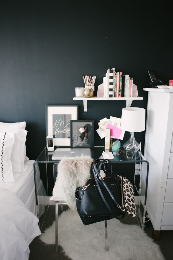
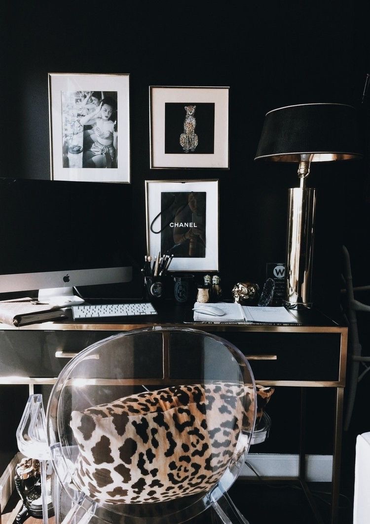
I adore this bedside vanity desk area from the vault files. Notice how against the black wall, the clear acrylic console table allows the color to shine through and doesn't distract from the chic color palette.
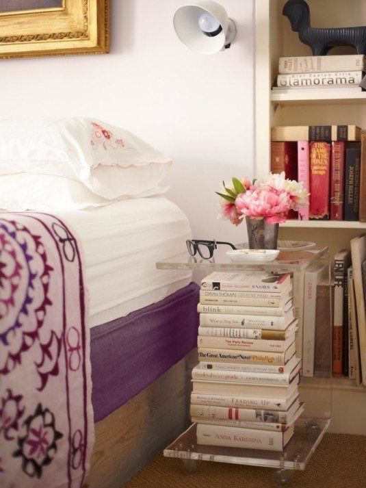
SIDE TABLES. Okay so, sometimes you will find yourself in a room where there may not be much space for a side table. That doesn't mean you shouldn't put anything there. A clear table can be worked in that area because it doesn't have to fit perfectly to look good. I also love the way stacks of books and magazines work on this type of table. As long as you display everything beautifully, it can absolutely look like an artistic little vignette.
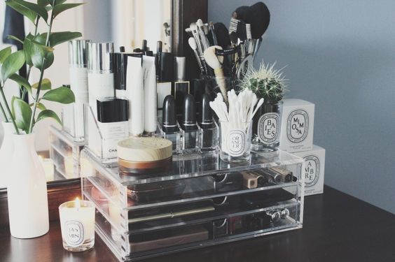
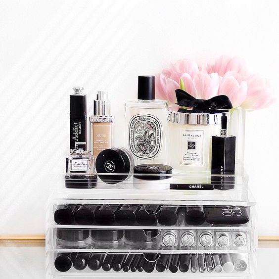
BEAUTY STORAGE. I've seen these beautiful displays of makeup look so chic in an acrylic box. It frees up your bathroom countertop space while still keeping everything in close reach. Plus, they really make fantastic instagram photos.
SHOP HERE FOR SOME OF MY FAVORITE ITEMS:


