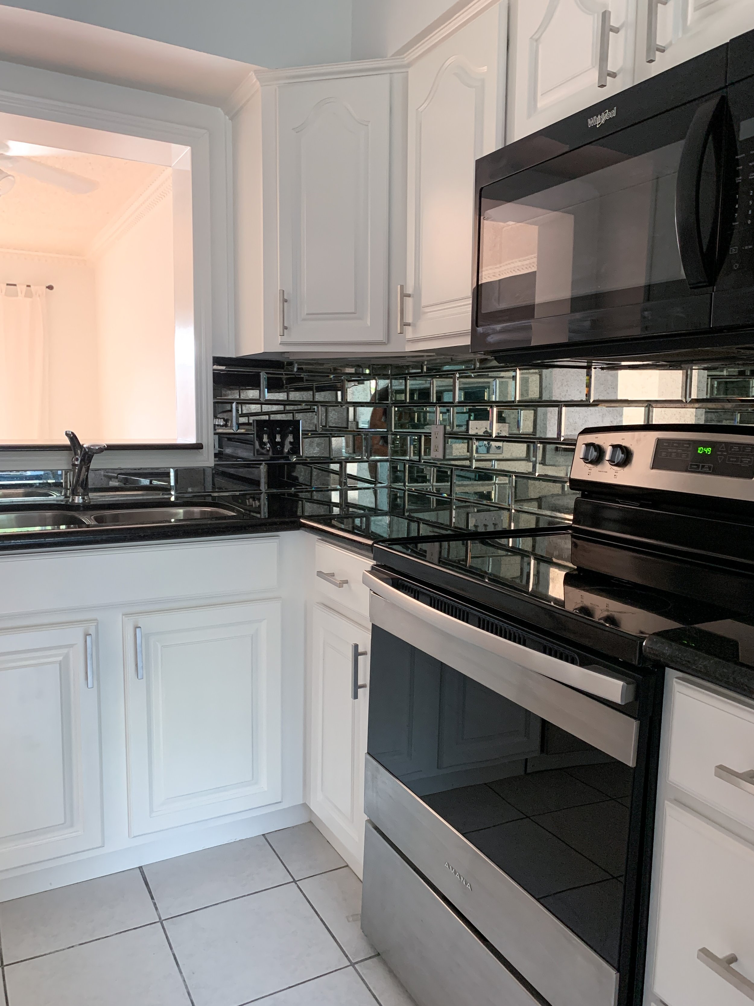
OMG. You guys. I am obsessed and I mean obsessed with my new townhome kitchen.
Honestly, when I first saw this home in photos, I was completely turned off by the kitchen even though the rest of the home was absolutely perfect for us. Luckily, I’ve always been a visionary and I actually enjoy imagining up a new potential for a space that is less than stellar. Living in Manhattan really helped me hone this skill.
I am a city girl. I love to live near the hustle and bustle. I love to be able to walk to coffee shops, be close to a gourmet grocery store and high end shopping centers. Some people would prefer to live a little outside of the city in order to have a bigger space but I am just NOT one of those people. Put me in the smallest home in the ritziest part of town and I’m happy as a peach in Summer. So for me, that means I have to work with what I can and if that means a smaller space, so be it.
When I decided to manifest my first home, the very first thing on my list was an all white and super bright kitchen. So, even though the kitchen was horrid looking and super small, I knew a little white paint would do the trick.
Let me walk you through this kitchen renovation process…..
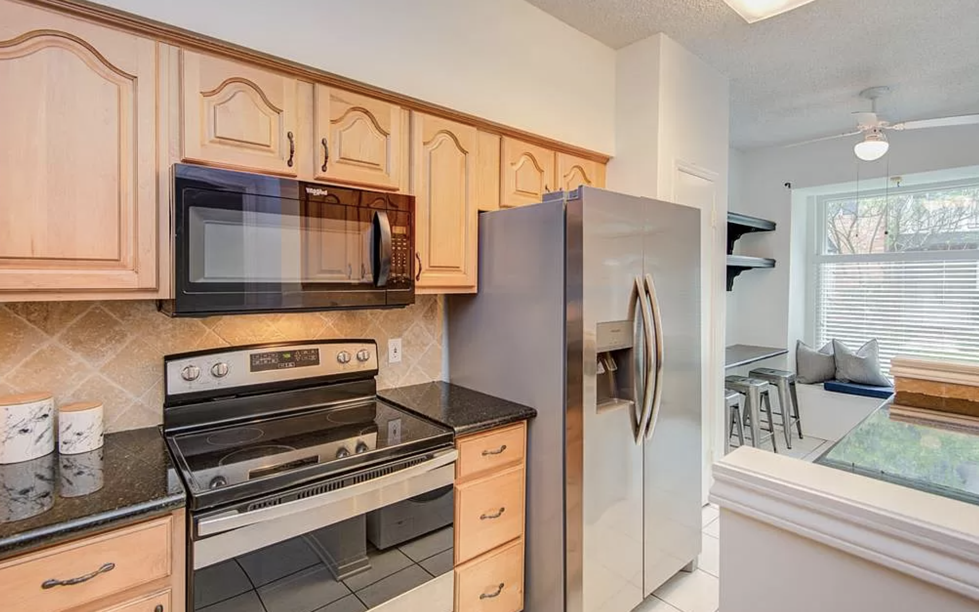
So here are a few photos of the kitchen from the listing. Bleh. This color of wood literally makes me cringe. I also abhor the backsplash, it literally makes zero sense to me why someone would take a completely bright, naturally lit kitchen and put warm taupe, beige with black appliances. Like, but why?
Anyway, I didn’t hate the layout, loooooved the natural light and also especially liked this little breakfast nook space off of the side of the kitchen because for me, as a work from home woman, I need a well lit office space and this is perfect to make my jewelry and film content for the House of Bliss!
I wasn’t really in love with anything in this kitchen but I knew I had to make it work. And, I did not have an unlimited budget to work with but knew I could do something without too much of an investment so here’s what I decided to do…
MY KITCHEN DESIGN PROCESS…
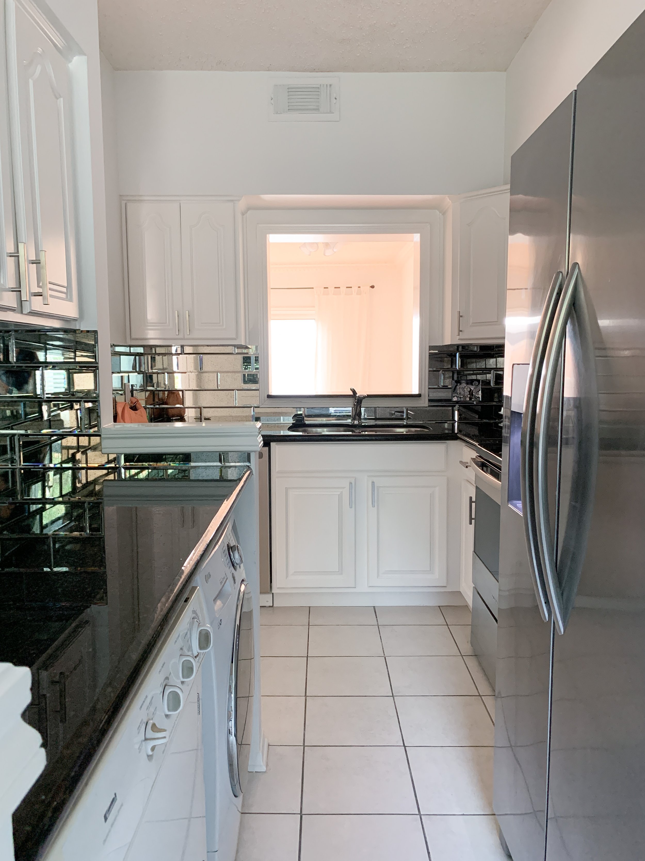
1) Instinctively, I knew I wanted to have the cabinets painted white. I’ve done this in so many clients homes and every time it completely transforms the kitchen so this is like my go-to move. For a second, I even considered purchasing new cabinetry from IKEA because they really have such good, modern cabinet looks and sizes. But, these ugly wood cabinets are BRAND SPANKING NEW and part of me just felt like it would be a waste to buy all new cabinets (not to mention installation) so I brought in a team to paint them a bright satin white.
2) So, the one thing I don’t hate about the kitchen is the black stone countertop. It is actually really beautiful and has a nice light reflection to it which I thought would be totally chic for an all white kitchen. So, I decided to leave that.
3) Get rid of that awful backsplash. Ugh. If I had to do only one thing, it would have been the backsplash. The day I got the keys to my new home, I had them rip it out immediately. lol
INSPIRATION:
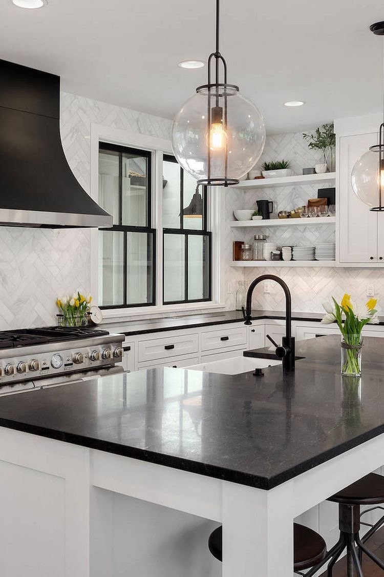
So here is one of my inspiration photos that I found and fell in love with. A beautiful, bright white kitchen with a little bit of black. It feels chic, bright and modern and I just kind of really love the black and white contrast.
I have always been obsessed with white subway tile in the kitchen, see this post for 13 of my favorite looks.
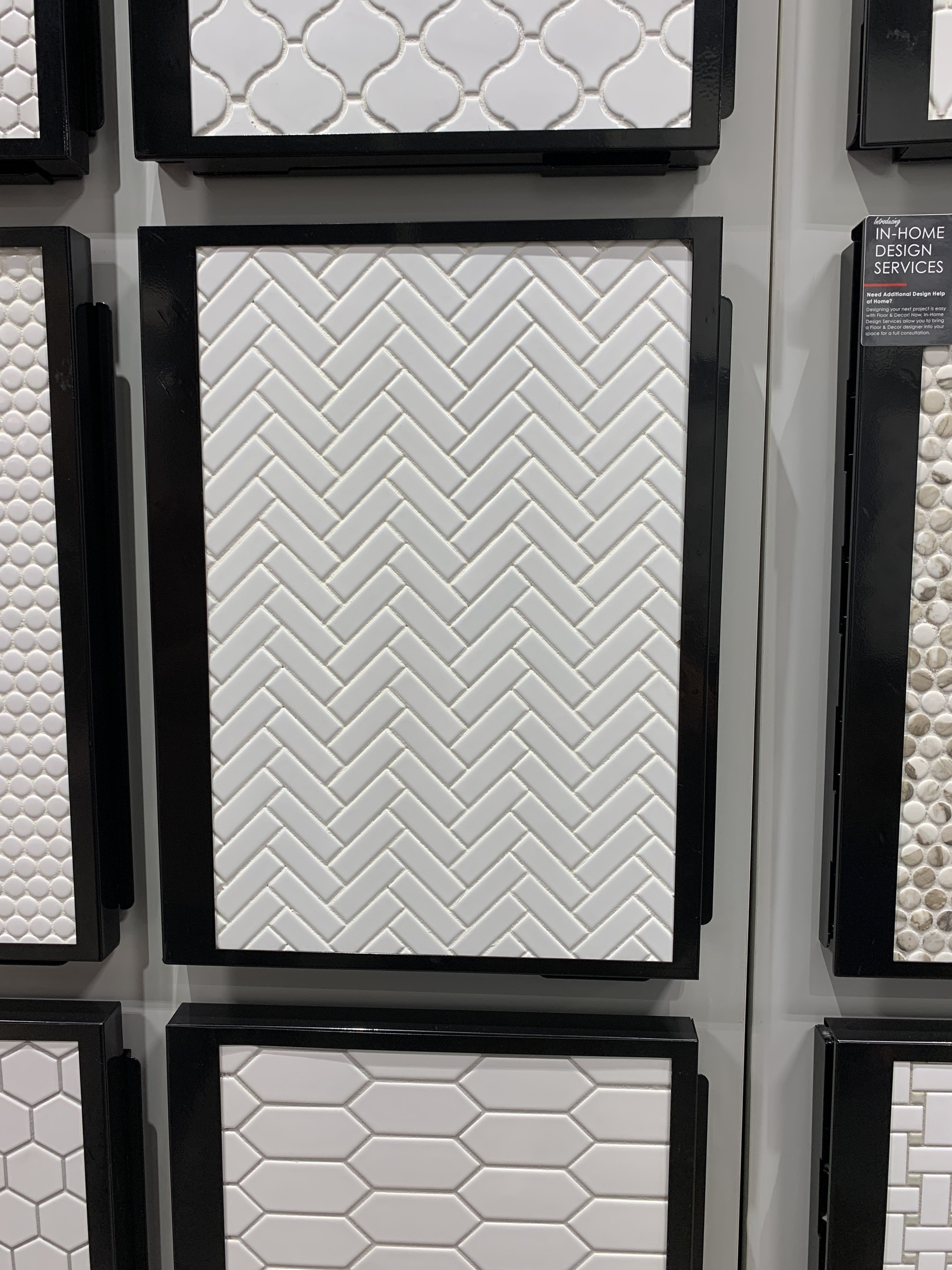
I headed to the tile store and because I knew they would have an extensive selection on backsplashes for me to look at, I headed straight for the simple all white tile. And after falling in love with the above photo, I was leaning toward an all white herringbone tile look. This one section of all white tile literally had so many options, I kind of felt overwhelmed by the patterns.
After mulling it over for a bit, I decided to go with the small herringbone tile. I thought it would look clean, simple and brighten up the space so well…until….
I spent over an hour walking around inside of the store. Trying to get excited about this very affordable and cute white herringbone tile for my new kitchen. But honestly, this was one of those moments where I had to do a gut check. It wasn’t exciting me at all. AND I have always been one of those people that preaches, “If you aren’t madly in love with it and it doesn’t excite you, it’s not meant for you”.
I DO NOT buy things that I am not obsessed with. Not handbags, shoes, jewelry…nothing. It is a rule and a non-negotiable for me. And here I was with 8 boxes of white herringbone tile I was just not excited about.
I walked over to the marble tiles, the beautiful pearlescent ones, too and nothing was doing it for me.
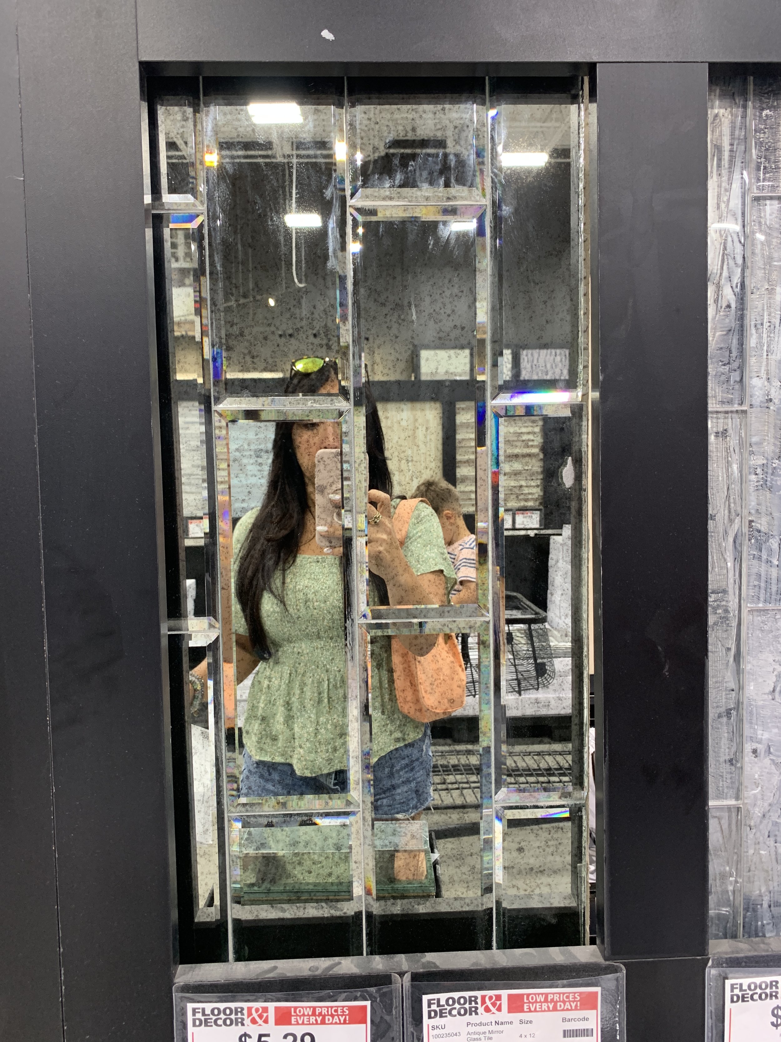
And then like a ton of bricks, it hit me… “do you have anything in like an antiqued mirror?” Veronica, the super helpful sales person, happily took me to the back section with the pricier tiles (of course) and lo and behold there it was. The most gorgeous, extra large antiqued mirror subway tiles with a bevel that literally just stole my heart.
And even though they were eight times the price of the white herringbone, my heart was pounding of excitement and I just knew these mirrored tiles would be the only thing that could brighten up my white kitchen and my soul even more than white tile.
SIDE NOTE: Now here is another really strong position that the mirrored tiles held for me. In Feng Shui, the stove is the wealth activator of the home. The burners represent health & opportunities for wealth. So, when you place a mirror reflecting what is on the burners, it will multiply and amplify those opportunities for health and wealth.
This is ultimately why I knew the mirrored backsplash was perfect, because it is EXCELLENT Feng Shui for my new home. If you want to learn more things like this, I put it all together in my course,
High Vibe Home : Organize, De-clutter & Decorate your home for harmony and bliss.
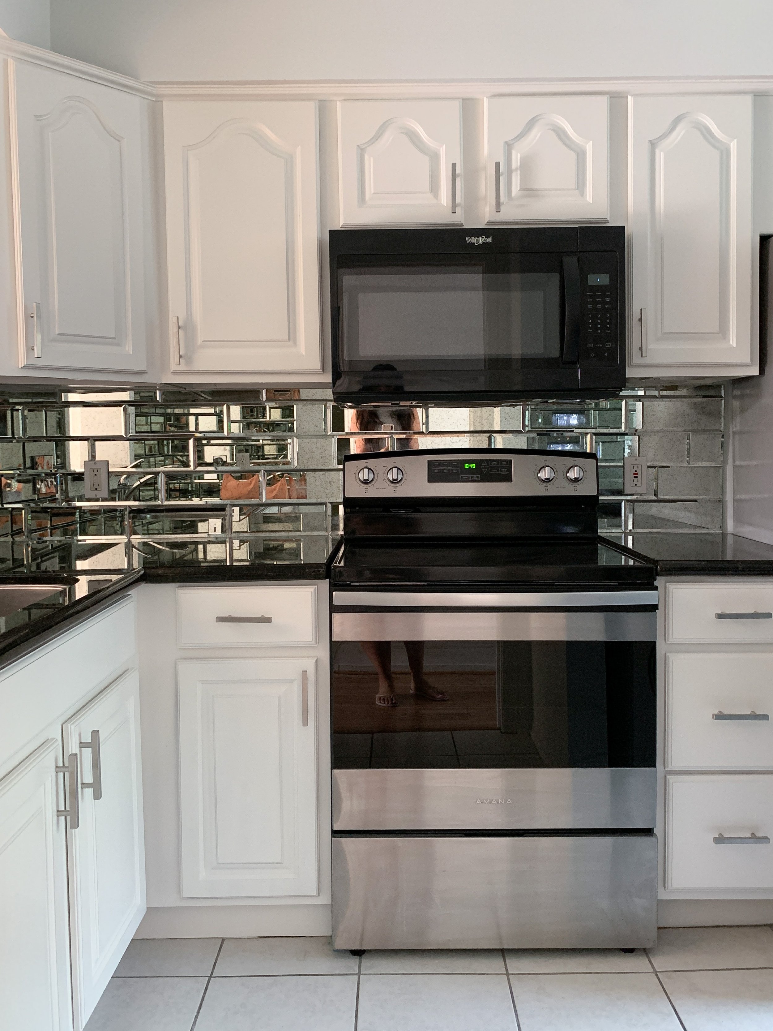
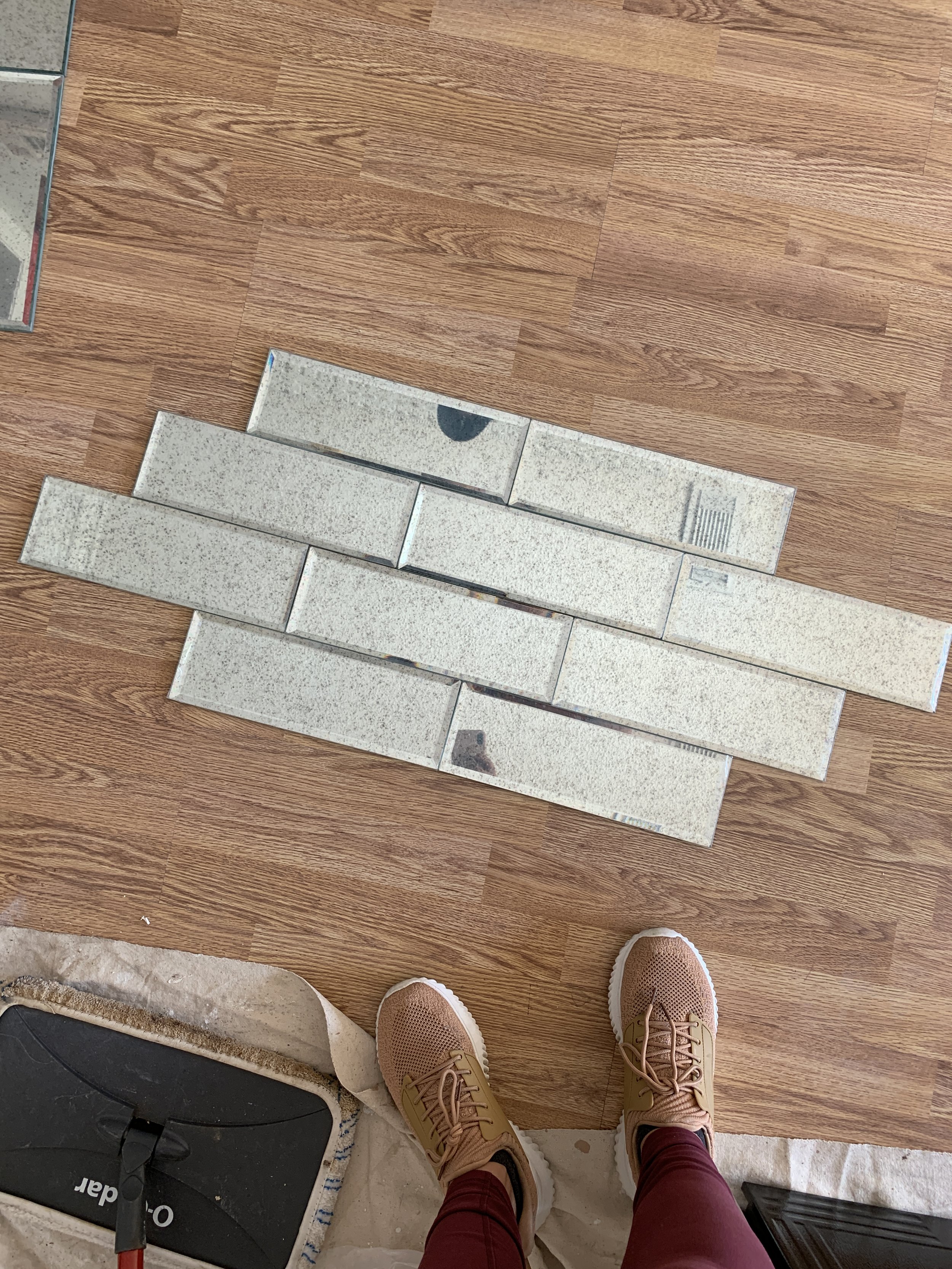
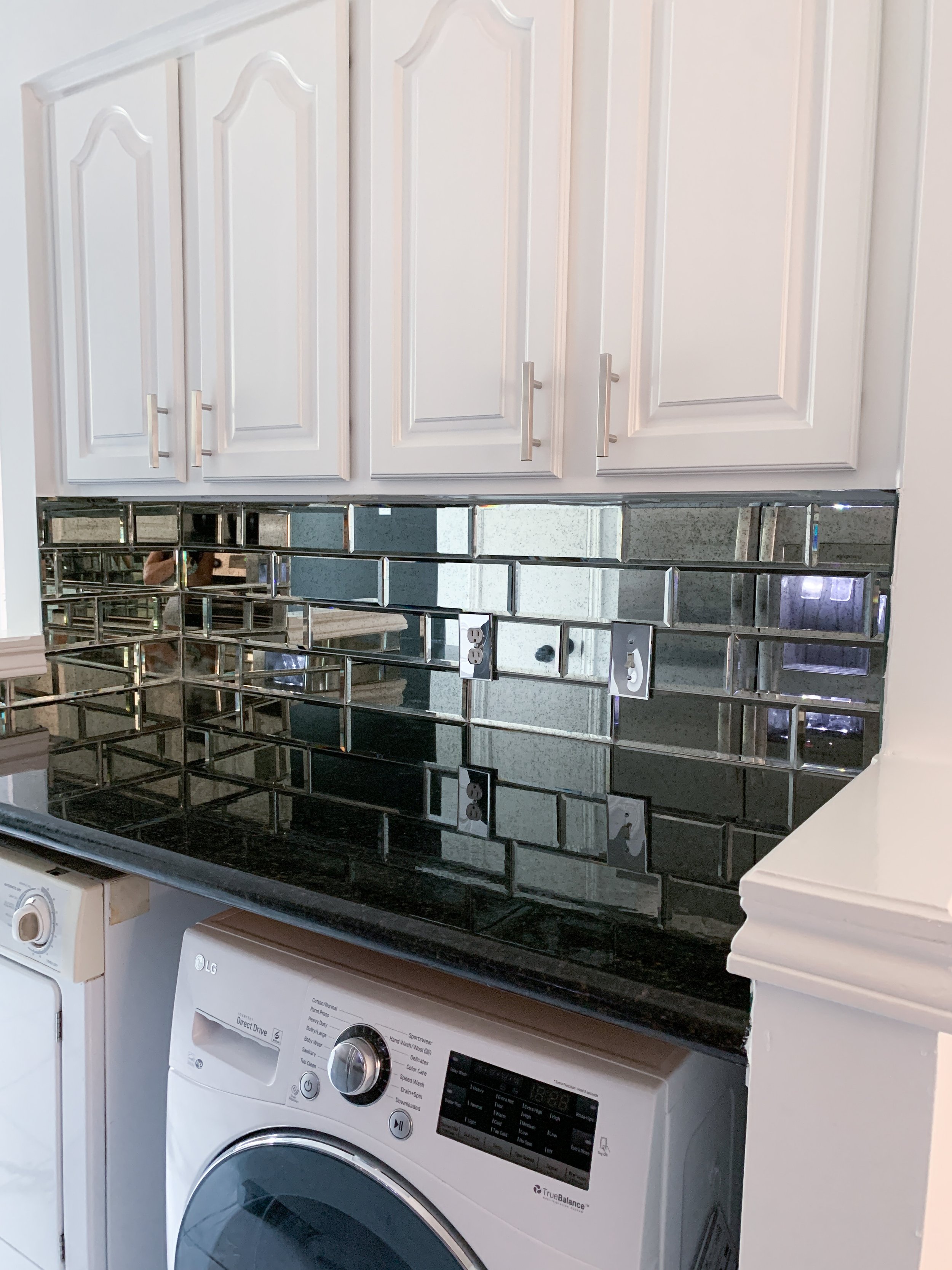
I ended up going with the 3 x 12” Antique Mirror Glossy Beveled tile and I am obsessed. To finish the look, I ordered mirrored switch plates because every detail needs to be tended
But here’s the other thing. I think subway tile can be kind of boring. I don’t know, I love a herringbone pattern or something different just not plain subway tile style. So I had my guy lay these in what you call a 1/3 or 33% offset pattern. It’s just a little bit different than the standard subway tile layout. I just think it looks better, a little bit more chic and stylish. So, if you do use subway tile in your home or project, you can try this layout for a little bit of a flair. Here’s what it looks like with my antique mirror tiles…
To top it off, I finished it all off with these chic brushed nickel cabinet pulls. They are clean and modern and really just blend in with the whole vibe. I would have gone for brass or gold but, with the appliances in stainless steel and black, the gold just would not look right.
So here she is, my dazzling little gem of a kitchen. These iphone pictures really don’t do her any justice. Literally a little dream come true for me. She is so beautiful, I literally cannot contain my love for this little kitchen. Anyway, I will be continuing the story on my new home and share all the updates and decor with you so stay tuned…
I hope you enjoyed this post. You may also like:

